UI/UX
CAREGIVER DASHBOARD DEVELOPMENT
(undisclosed project)
**This work is currently in production and not yet complete.
I am currently developing a caregiver dashboard. The primary function ( and most parent/caregiver portals) is boosting communication, a quick overview(monitoring), transparency, and secured access. This client also wants this to be a place of rewords and delightful interactions.
Right- This was the current visual style at the time I came on to the project. I felt the immediate task was to strip out visual noise and create more hierarchy.
The bottom image is a sample of early iterations and a limited color palette.
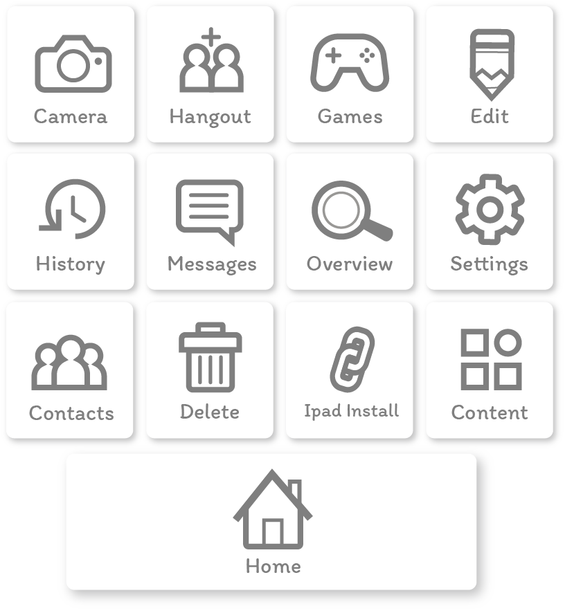
Below right- New iconography just using gray, taking away the color that didn’t really play any role in functionality in the earlier concepts.

MOBILE LAYOUT ITERATIONS
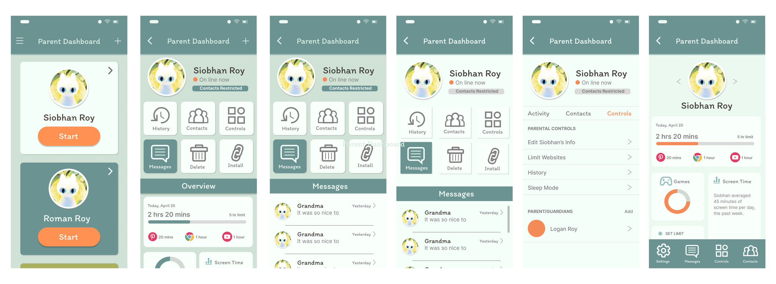
As in my early designs and at the client’s request, I kept an icon driven approach in my layouts. What became evident quickly, is that on vertical layouts, the buttons took up so much of the view, that when selecting them or trying to get a quick overview, they became obstacles. My later iterations, it was decided to move the main icons to the bottom of the layout. Once the adult caregiver clicks a profile, your next screen will display data that can be read quickly.

1
2
3

COMPONENTS AND STYLES
To the right, are a collection of early thoughts on color palette, fonts, modals, buttons and layout styling. I removed black and replaced it with a high contrasting deep brown. This helps soften the interface and prevents a high contrast area from pulling focus.
FIGMA PROTOTYPE
This protype includes multiple ideas around layout. The first profile when clicked takes you to the most recent iteration with an overview and icons at the bottom of the screen. The second profile takes you to past iterations with icons prominently at the top of the layout. Clicking the messages icon takes you to an alternate message layout. Next steps are to add some gamification elements and moments of delight for both caregiver and child.
This project is currently in production. I’ll be updating progress as things are further developed.
TANGRAM BITS
Amazon Glow game
One of only a few games released on the Amazon Glow device. This game used a set of tangible tangram shapes placed on the screen. The game had a progression to different islands and themes.
I was responsible for Art Direction, character design, UI design and some animation concepts.
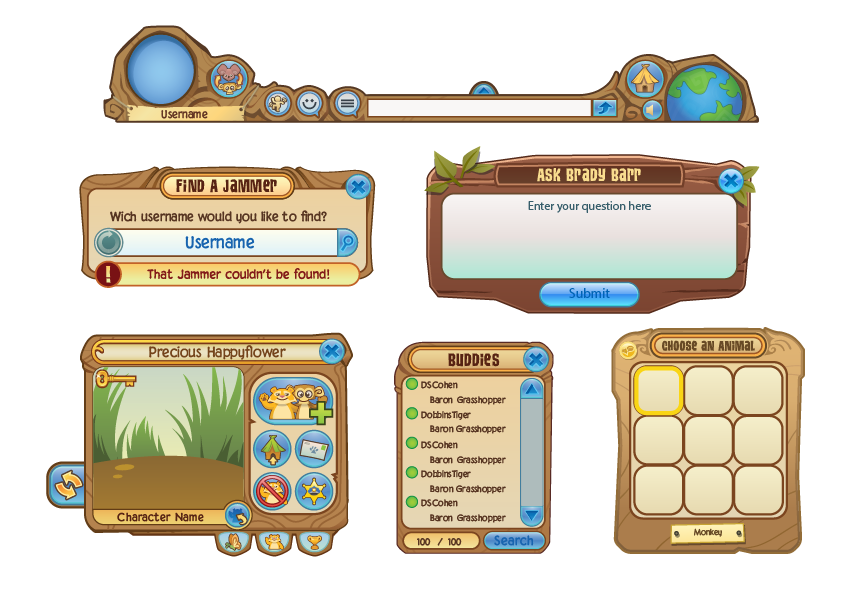
ANIMAL JAM UI
Just as the world was built by our animal inhabitants, modals, buttons and other assets are chunky and rough as it’s structures are. This also kept our HUD and other interactions visible even on smaller devices.
These are examples of various assets used as visual cues to inspire the user interface the Animal Jam IP as well as various pop-ups, buttons and icons used through out the game as it grew in scope and functionality.
Bright, happy and fun! Icons were more saturated and had a soft outline to set them apart from the background and in game assets.


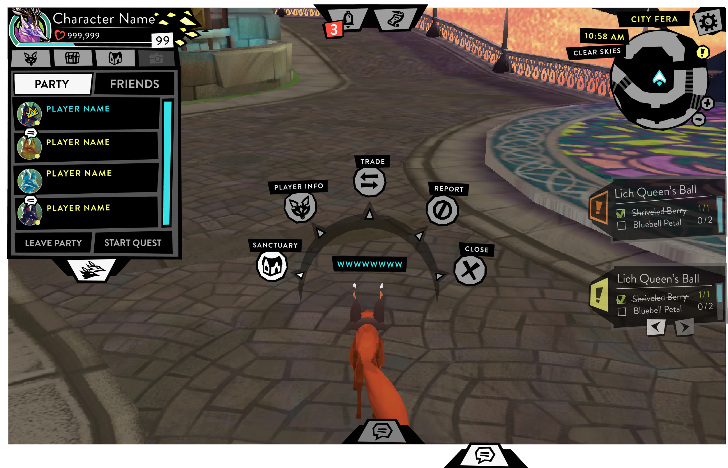
FERAL UI
The Feral IP was meant to recapture our Animal Jam audience as they aged out. Feral’s age target was 9-16+. It included the illusive ‘tween’ market. I wanted this property to stand completely apart in everyway including the UI. Feral doubled down on every play pattern that made Animal Jam a success.
This IP was not confined by real world animal references but now fantastical creatures that could be customized in multiple ways. This made the UI a challenge to address all the features and choices available to the player. I made the UI basically black and white and much more graphic than the background in order to read more clearly and not blend with the play space.


Font, containers, headers and colors used across the Feral IP.
The screen shot left displays how the HUD is organized on screen. The social aspect and customization were the primary interactions. These modals needed to be easy to access and visually easy to read.